
The Drop is a fundamental and differentiating component within our design system. We use it as a graphical element in patterns, masks, and illustrations to reinforce our brand when opportunities emerge, but please resource the below guidance to ensure it is represented correctly.
Imagery and video
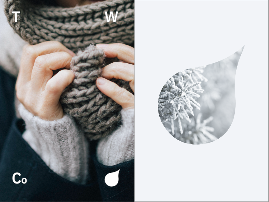
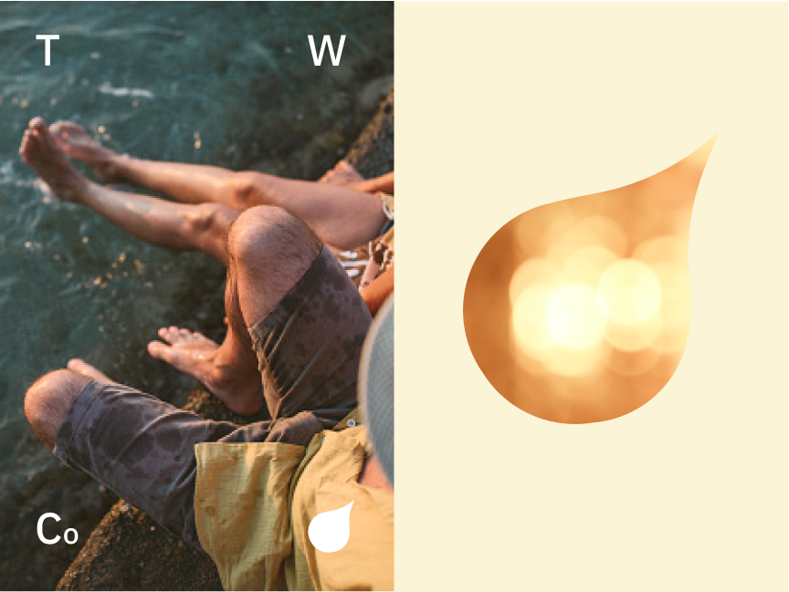
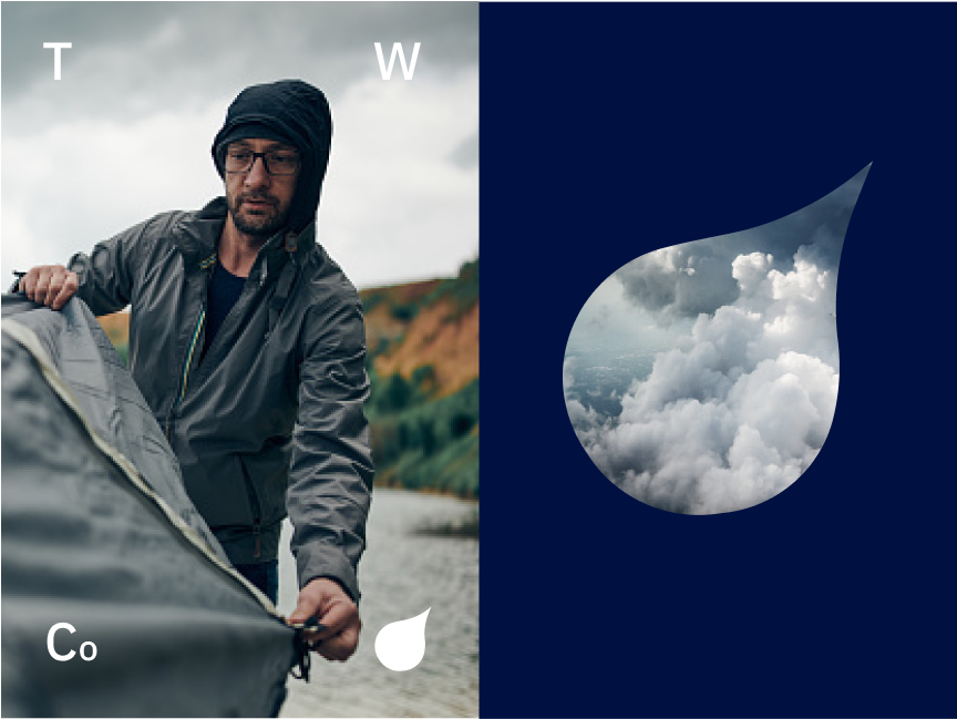
Use the drop as a portal or mask to images. When doing so, be cognizant of color. We have found that keeping the surrounding color as a complimentary color or of the same palette typically makes for the best results.

Back Drops
The drop is great element in backdrops for murals, desktops, or floor graphics.
Be sure to reference the color guidance when selecting multiple colors for designs.


Cropped Drop
In some instances we crop the “Drop” to make use of the curve as a container. In these cases there is a threshold in where it still retains it’s recognition as a drop shape that includes the top curve at the top tip, and the exterior curve.
Use the “s-curve” that includes the curves both at the top and side of the drop when using it as a design container.
Don’t crop in too tight that the drop is completely unrecognizable.
Drop outline
There are circumstances where we can outline the “Drop.” When doing so be sure to not make the stroke too thick. Here are a couple do’s and don’ts to look out for. If looking to execute an outline of the “Drop” please reach out to the Creative Marketing Department for additional assistance.
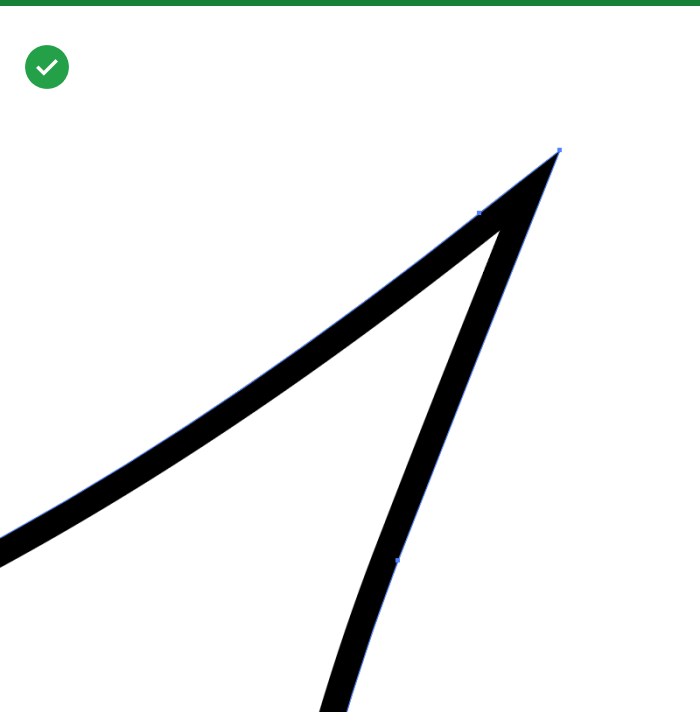
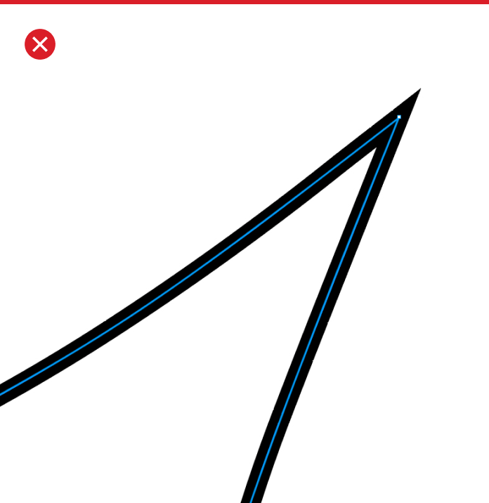
To retain the stroke shape, use the stroke setting that aligns the stroke to the inside of the “Drop”
Don’t use any stroke alignment outside of the shape of the “Drop”
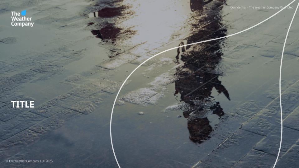
Drop integration as an element
The Drop is an element that can create brand recognition by seamlessly integrating itself into imagery to create visual interest as well as ownership in an image. When utilizing the drop consider it’s stroke weight so that it isn’t distracting the context of the image but also doesn’t get lost by becoming too thin. The Drop should be an organic design compliment.
Also, see the photography page to know the type of imagery we want to use in our branding and how we sometimes will choose to integrate the drop to interact with the image subject.
Use the Drop as a tag/sign off.
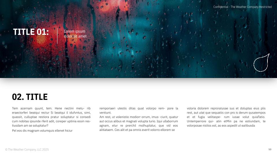
Vertical shadowing
Vertical shadowing is an element used when needing to create delineation of information. It is used sparingly and is reserved for use in presentations for prioritizing and differentiation of elements on a slide.
Vertical shadowing can be used to delineate 2 graphic sections of a presentation slide to help support them as separate elements

Vertical shadowing should be used to on a photograph when used on a white background for text.
Color Overlays
If needed use a color overlay to help the text standout on an image. When doing so make sure it is from our brand color palette and doesn’t look awkward against the image it is overlaid on.