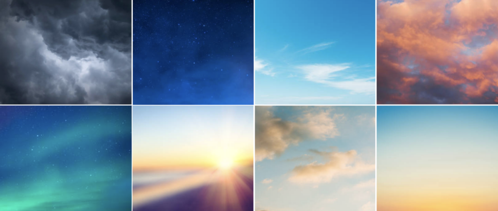
The Weather Company color palette is flexible and derives with different intentions that are applicable to the visual expression of a branded house. A vibrant set of blues is at the core, but our palette is accented by a selection of additional hues to give it unique value. These combined colors are essential to illuminating the value of weather insights, while demonstrating our core inspiration, the sky.
Inspiration
Our inspiration for our color palette is unique and not dissociative to the center of our brand, weather. The color selection is a system inspired by the atmosphere and naturally connects in its familiarity with audiences who experience us in an array of creative executions and marketing communication.


Primary colors
For consistency across our brand expressions, always prioritize our blue palette. Blue is our foundational color hue for a variety of reasons: it is the hue of all our brand identities including The Weather Company and The Weather Channel. Additionally, it is consistent in always being inclusive in where we draw our initial inspiration, the sky.
- Generally, only one color should be featured per brand expression. For long-form applications, complex illustrations, or experiences, it may make sense to use more colors up to 4 from our color pairings throughout to create rhythm and emphasis.
- Blue 80 may be used for the logotype, hero graphics and large typographic moments on these backgrounds. When working with a universal template, use Black.
- Blue 60 should be maintained as a standard highlight color for subheads, data, and buttons.
- Some production instances may demand adjustments to color value up or down one or 2 steps. Examples include video sequencing, printing substrates or merchandise material.
Blue 100
#001141
r:0 g:17 b:65
PMS: 282
c100 m91 y9 k1
Cyan 40
#33B1FF
r:51 g:177 b:255
PMS: 299
c62 m18 y0 k0
Blue 80
#002D9C
r:0 g:45 b:156
PMS: Reflex Blue
c100 m91 y9 k1
Teal 20
#9EF0F0
r:158 g:240 b:240
PMS: 317
c11 m0 y5 k0
Blue 60
#0F62FE
r:15 g:98 b:254
PMS: 2132
c80 m60 y0 k0
White
#FFFFFF
r:255 g:255 b:255
PMS: –
c0 m0 y0 k0
Secondary colors
White backgrounds are essential and should be used predominantly for long-form applications. Where necessary, use lighter values 20 and under as a secondary color for backgrounds in placements like presentations that require contrast. This treatment is useful for text-heavy applications, or to help organize information. Just as with primary colors, only one secondary color should be featured per brand expression. In some cases, such as for long-form applications or experiences, it may make sense to use two or three colors throughout to create rhythm and emphasis
Orange 30
#FFB784
r:136 g:136 b:136
PMS: 7410
c0 m33 y53 k0
Yellow 10
#FCF4D6
r:136 g:136 b:136
PMS: –
c1 m2 y19 k0
Neutrals
White is a “neutral” but is essential and should be used predominantly for long-form applications. Neutrals are accessible when necessary to create emphasis or accent when there is a tendency to overuse the color palette but emphasis is needed. They can be useful in applications like title cards where a third tone is necessary in a graphic or text to create visual interest or emphasis.
Cool Gray 80
#343A3F
r52 g58 b63
PMS: 2166
c68 m61 y60 k49
Cool Gray 30
#C1C7CD
r193 g199 b205
PMS: 537
c25 m20 y21 k0
Cool Gray 10
#F2F4F8
r52 g58 b63
PMS: 2166
c68 m61 y60 k49
Implementing colors
Color is a foundation of our brand, but it can also easily lose brand distinction if overused without identifiable branded color combinations. We identified recommended color combinations to be used for a visual consistency of the brand. We’ve listed when we foresee these combinations being applicable, but if there are any questions regarding their use, please reach out to the design team with questions.
2-Color combinations
Our color combinations are formulaic in the sense that we base them on a tonal differentiation of 3 steps (30%) and are created around our primary palette of blues (Blue 60, Blue 80, and Blue 100). Please default to our hero color combination whenever possible. We foresee these color combinations being utilized in: text on a color background, deck schematics, data visualization, illustration, email, and newsletters.
Hero 2-Color combination
2-a
Blue 80
#002D9C
Cyan 40
#33B1FF
Supportive 2-Color combination
2-b
2-c
2-d
Blue 80
#002D9C
Orange 30
#FFB784
Blue 60
#0F62FE
Teal 20
#9EF0F0
Blue 100
#001141
Blue 60
#0F62FE
3-Color combinations
Our 3-Color combinations are derivative of our 2 color combinations (see above), but take on an additional tonal value within the same color family to the complimenting secondary color. This way we keep consistent color palettes without arbitrary pairings that are harder to control and contribute to less brand association. We foresee these color combinations being utilized in: deck schematics, data visualization, illustration, email, and newsletters.
3-a
Blue 80
#002D9C
Cyan 40
#33B1FF
Teal 20
#9EF0F0
3-b
Blue 80
#002D9C
Orange 30
#FFB784
Yellow 10
#FCF4D6
4-Color combinations
4-Color combinations are also derivative of our 2 and 3-Color combinations (see above), and take on an additional tonal values 3 steps (30% tonal value difference) within the same color family to keep within tonal distinction to serve purpose of depth when used in illustration. They have also been named to help identify them, but also to reveal the inspiration they hold in representing colors in the sky. The only other values added to the 4 colors to extend it are white (#ffffff) and black (#000000). Options we foresee these color combinations being utilized in: data visualization and illustration.
“Clear day” 4-Color combination
4-a
Blue 80
#002D9C
Blue 60
#0F62FE
Cyan 40
#33B1FF
Teal 20
#9EF0F0
“Evening Sky” 4-Color combination
4-b
Blue 80
#002D9C
Cyan 40
#33B1FF
Orange 30
#FFB784
Yellow 10
#FCF4D6
Color gradients
Using the color combinations provided, feel free to create gradients to create backgrounds that may feel more digital or ethereal. When creating a gradient it is imperative to keep colors relative to the brand colors.


