
A typography palette, like color, represents the tone and values of your brand. Proper usage of type across all brand touch points ensures consistent communications. The power of the Plex® font family is in how it subtly elevates our images and imparts a deeper meaning to our words. Here’s how we use it to express The Weather Company brand.
Typography
The primary font for headlines is Plex® Sans Light to reinforce the feeling of a precise, but nimble, brand. The secondary fonts are Plex® Sans Regular and Plex® Mono Regular. A range of Plex® fonts, incorporating sans, italic and mono, can be used deliberately to create texture. Bigger typographic moments should be used to force an economy of language and create hierarchy.
Download the full font set of Plex here
Plex Sans Light
Primary weight for headlines
Plex Sans SemiBold
Alternate weight for headlines
Plex Sans Regular
Use for body copy and CTAs
Plex Mono Regular
Use for body copy and CTAs
Implementing Color
When implementing color, refer to our branded color approach in our color guidance section.
The Weather Company Color Guidance

Tracking
Plex® has been designed to not be spaced tightly. It requires space to breathe comfortably within text and headlines. It’s lighter in appearance and is more legible when spaced appropriately.
Flush Left
Flush left justification telegraphs our editorial lineage, our scientific roots and creates strong alignments for the eye to follow, aiding readability and organization. It is functional, timeless and to be used as our standard for all typography across The Weather Company.
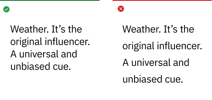
Leading
Choosing the appropriate leading or line spacing is very important to the reading quality and efficiency of the typography. It should never be too open or too tight which makes reading difficult and unpleasant for the reader.
Punctuation
The use of spacing and certain typographical devices are important to understanding and correct reading. The typographical details of correct punctuation aid in interpretation, division of text into sentences and clauses, and is critical to disambiguate the meaning of sentences.
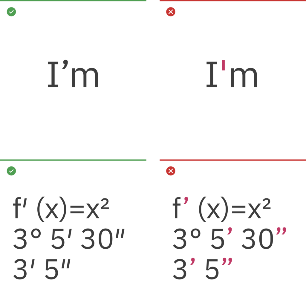
Apostrophes and primes
Apostrophes indicate possession, for example, Harry’s book or the boys’ coats. They can also indicate the omission of letters or numbers. Primes are commonly used for minutes, seconds, feet, inches and degrees. Lucky for us, Plex includes them. Many fonts don’t.
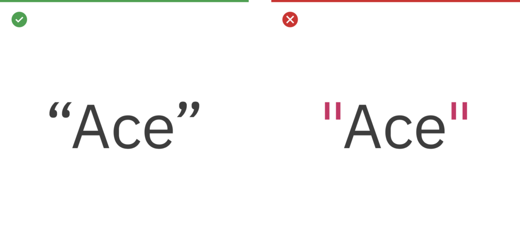
Quotes
Use left and right “curly quotes” when quote marks are required. They are design sensitive, intended to match or blend within Plex. Avoid using “straight” quotes. These are a relic from the typewriter days, and a common error in modern typography.
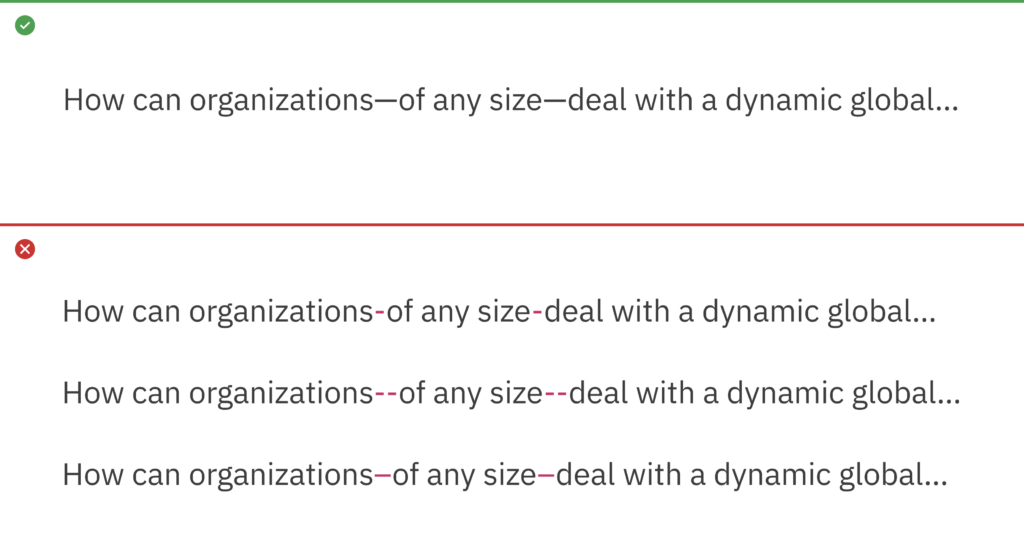
Em dash
The em dash is used to create a strong break in the structure of a sentence. Hyphens and en dashes are not appropriate alternatives for em dashes.
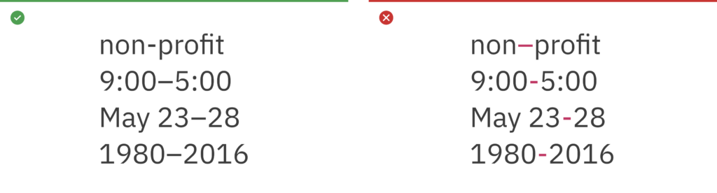
Hyphen and en dash (-, –)
Some examples of correct use of hyphens and en dashes are shown here. An en dash is used to span or ranges of numbers (1945–1975) and the hyphen is for compound terms (check-in).
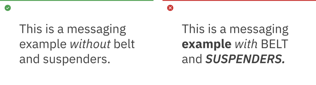
Belt and suspenders
The term “belt and suspenders” refers to using multiple styles to do the same thing in typography. The Weather Company should always be essential, so keep styles to a minimum when emphasizing words in messaging.
Case
Write content in sentence case. Title case can be used in proper titles, product names and service names. Avoid the use of all uppercase or “all caps” in your typography, especially for paragraphs or text.

Exception
All caps may be reserved for use in presentations for prioritizing and differentiation of elements on a slide.
Exception Example 1

Exception Example 2

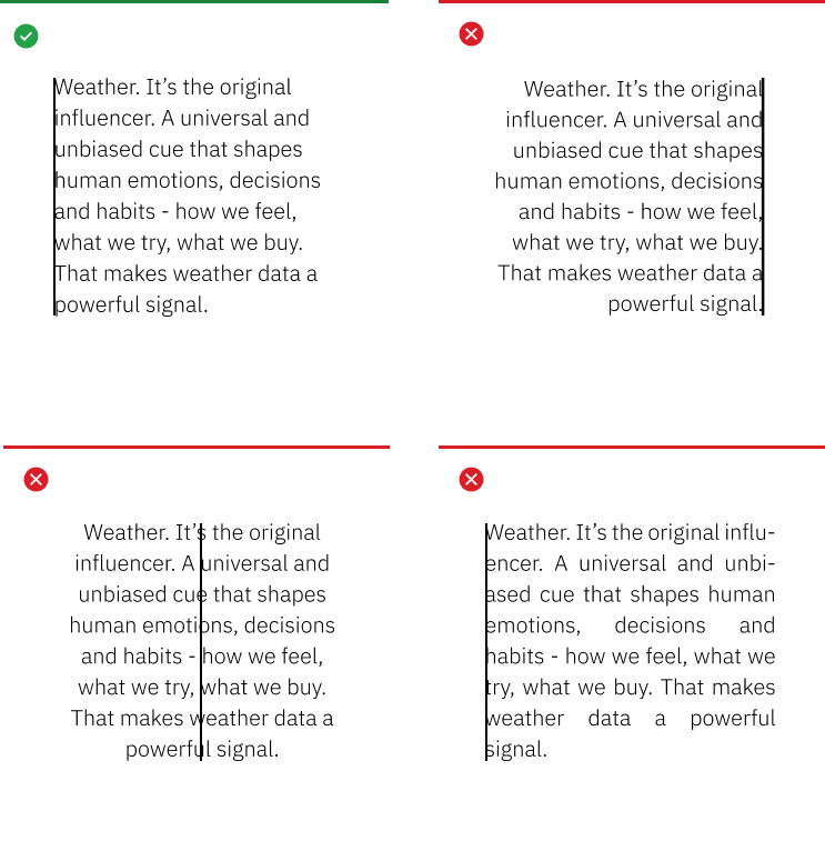
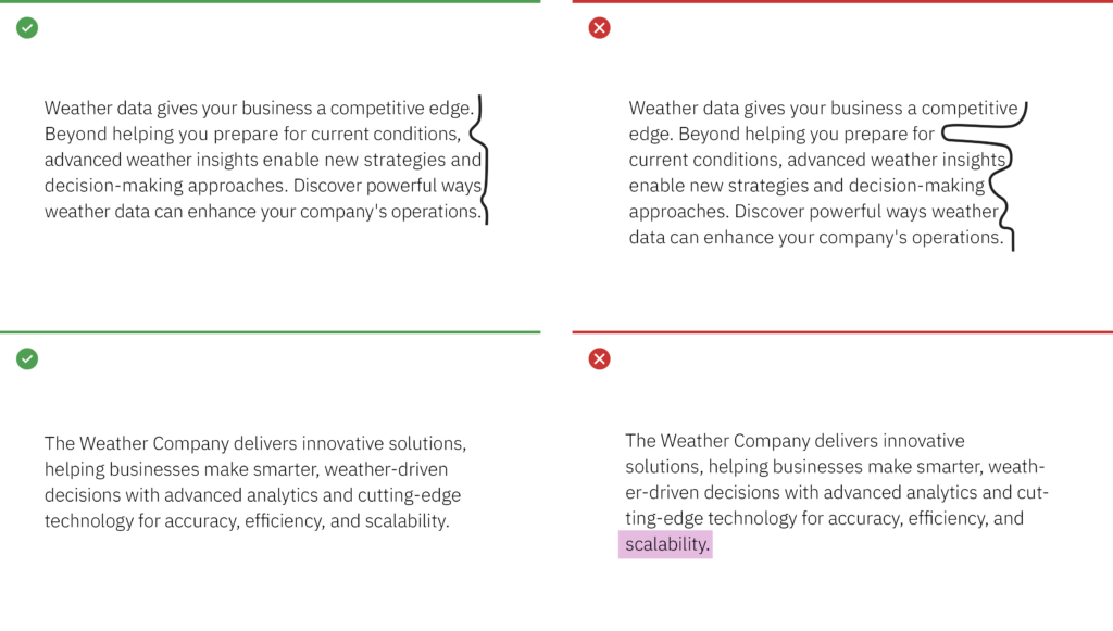
Rags, orphans and widows
Always look for opportunities to create improved rags, or ragged edges on the right margin. Watch out for orphans and widows and adjust line lengths with a writer to solve awkward breaks which can affect reading quality.
Alignment
Whenever possible, left-align copy with other copy, even when it’s in a container element. This creates a strong vertical alignment with the text, adding in legibility, organization and clarity for a user.


Line lengths within containers
Consider adding extra-padding-right in a container to preserve openness in the typography. This prevents text from going edge to edge in a container, and helps the reader.


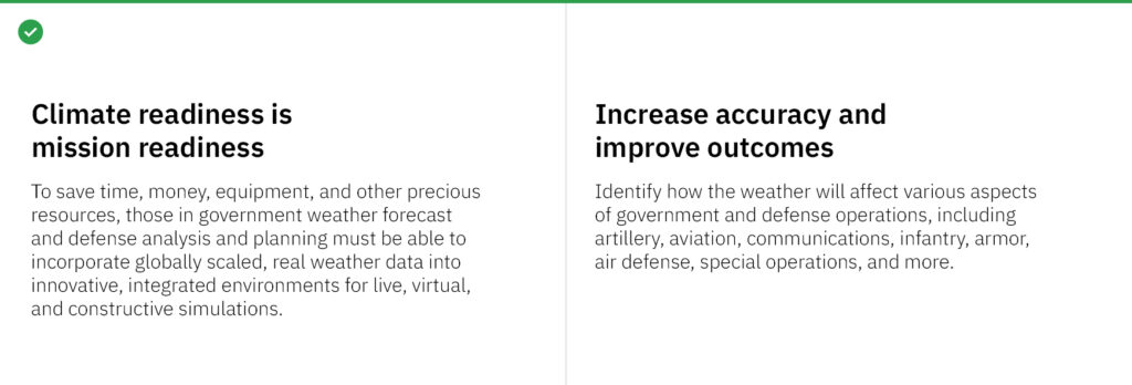
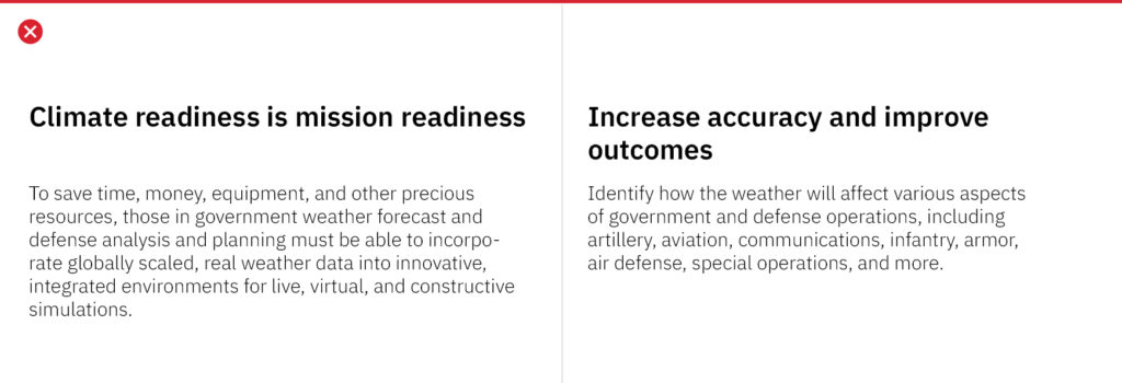
Stacked headlines
Stack headlines into two or even three lines versus keeping them in one long line. This helps create a compact reading unit for the headline, and can help control or avoid widows.
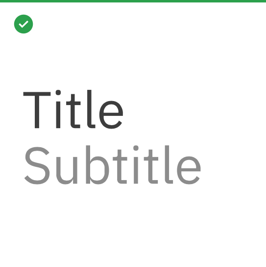
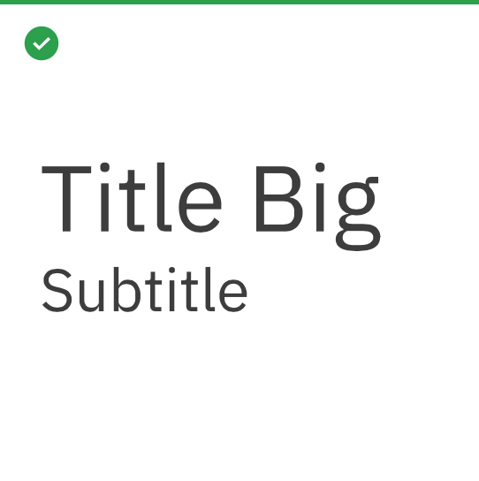
Titles and subtitles
Examples of how to differentiate titles and subtitles by weight or contrast change are shown here. It’s important to keep it simple and not create titles that are too long.
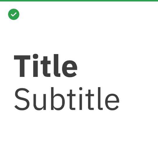
Bold with regular
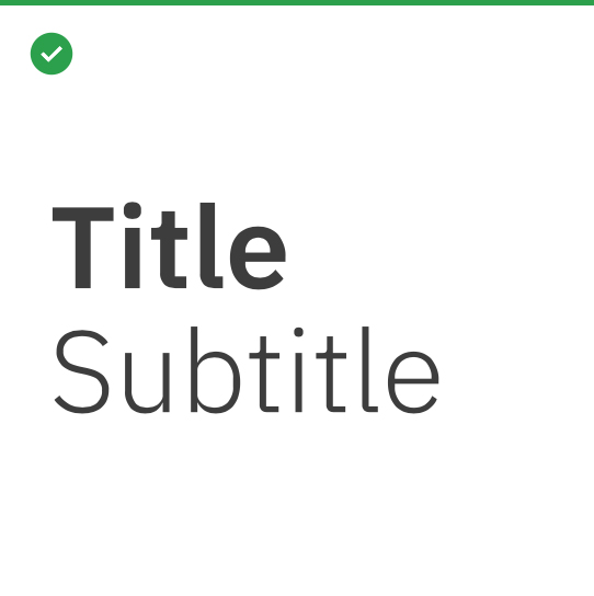
Semibold with Light
Contrast with one weight
Scale with one weight
Scale with one weight