
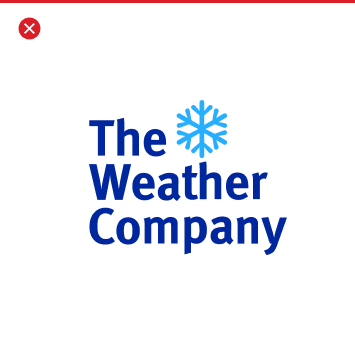
Our wordmark reflects both our lineage and our future. We’ve developed some visual equity in the wordmark by drafting off of the very recognizable The Weather Channel wordmark. By incorporating additional brand elements, we will create opportunities to evolve our expression as a singular, united brand across all of our lines of business.
Resources
If you’d like to resource wordmarks click the link below to our Google Drive folder with an assortment of versions in both vector and raster. If you need assistance in an additional format please reach out to the Marketing Creative Team.
Wordmark Folder

Anatomy
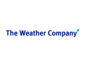
The Weather Company mark is composed of elements that work holistically together. In order to treat them correctly as a whole, it is important to know their significance in relation to our overall branding.

Typeface – We use FF Meta Sans for our wordmark. It is familiar in that is the typeface used in The Weather Channel wordmark and unifies our association with our familiar consumer brand.
The Drop – We have a complete tab dedicated to our “Drop” but in short, it is a distinguishable element that says “weather’ but is also a hard working form to systemize our branded elements and executions. Please refer to the resource for guidance.
Color – Color is outlined below, please refer further down this page for a more detailed explanation to color approach in relation to our wordmark.
Spacing – Distances and spacing is also broken down further on this page. Please use this guidance to ensure that we don’t overcrowd or manipulate the wordmark in inappropriate ways.
SM – The Service Mark symbol next to the Drop should always be present and should be represented in the same color as the The Weather Company text.
Color
Brand color is covered in depth in a separate tab on this resource website, so if needed please refer to that tab for an overview of our brand color approach. Here, we will cover the color approach specifically to the wordmark considerations.
Hero 2-color combination
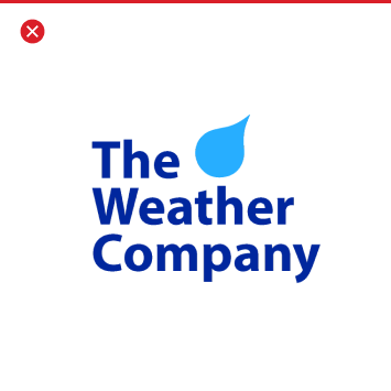
When used against a light color or on its own it is recommended that we utilize our hero 2-color combination of Blue 80 and Cyan 40. These colors are equally recommended to be hero colors for the brand at large.
Blue 80
#002D9C
r:0 g:45 b:156
PMS: Reflex Blue
c100 m91 y9 k1
Cyan 40
#33B1FF
r:51 g:177 b:255
PMS: 299
c62 m18 y0 k0

Hero 2-color combination (reversed)
When used against a light color or on its own it is recommended that we utilize our hero 2-color combination of Blue 80 and Cyan 40. These colors are equally recommended to be hero colors for the brand at large.
White
#FFFFFF
Cyan 40
#33B1FF
r:51 g:177 b:255
PMS: 299
c62 m18 y0 k0
Single colors
It is recommended to either use a dark color like black or Blue 80 when needing to represent the wordmark in one color. When representing over a dark color, and one color is necessary, it is recommended that it be white. Other colors can be used on occasion, but it is not recommended unless the creative team has reviewed the execution to ensure readability.
Inline and stacked versions
Creating a consistent and optimal presence of our wordmark is critical, and there are 2 available versions of our logo that can be used. In order to know what considerations are factored into choosing a logo format, refer to the below.

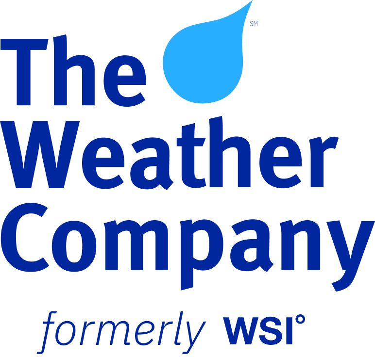
Stacked
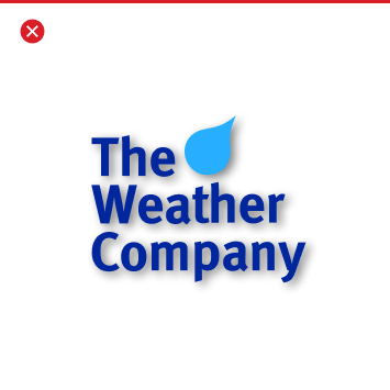
Our stacked version of our wordmark is our hero version and should always be prioritized because for brand recognition. When using our stacked logo it should never be modified or distorted
Inline version
Our inline version of our wordmark is to only be used in placements where the stacked can not be optimally represented. Examples of this could be in narrowly horizontal placements like leaderboard banners and in presentation templates.
Clear Space
In order for the wordmark to not feel crowded and to stay readable it needs appropriate spacing surrounding it. Use the following guidance.
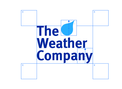
Stacked Distance:
The “X” variable is based on the distance that is the height of the drop. When establishing this distance, the clear space surrounding the wordmark needs to be the height and width of “X” distance. at a minimum.
Note: This same “X” distance can be referenced between the bottom of the “e” and “y” int the stacked wordmark.
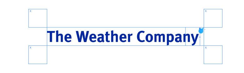
Inline Distance:
The “X” variable for distance is based on the distance that is the bottom of the descender of the “y” and th height of the drop. When establishing this distance, the clear space surrounding the wordmark needs to be the height and width of “X” distance at a minimum.
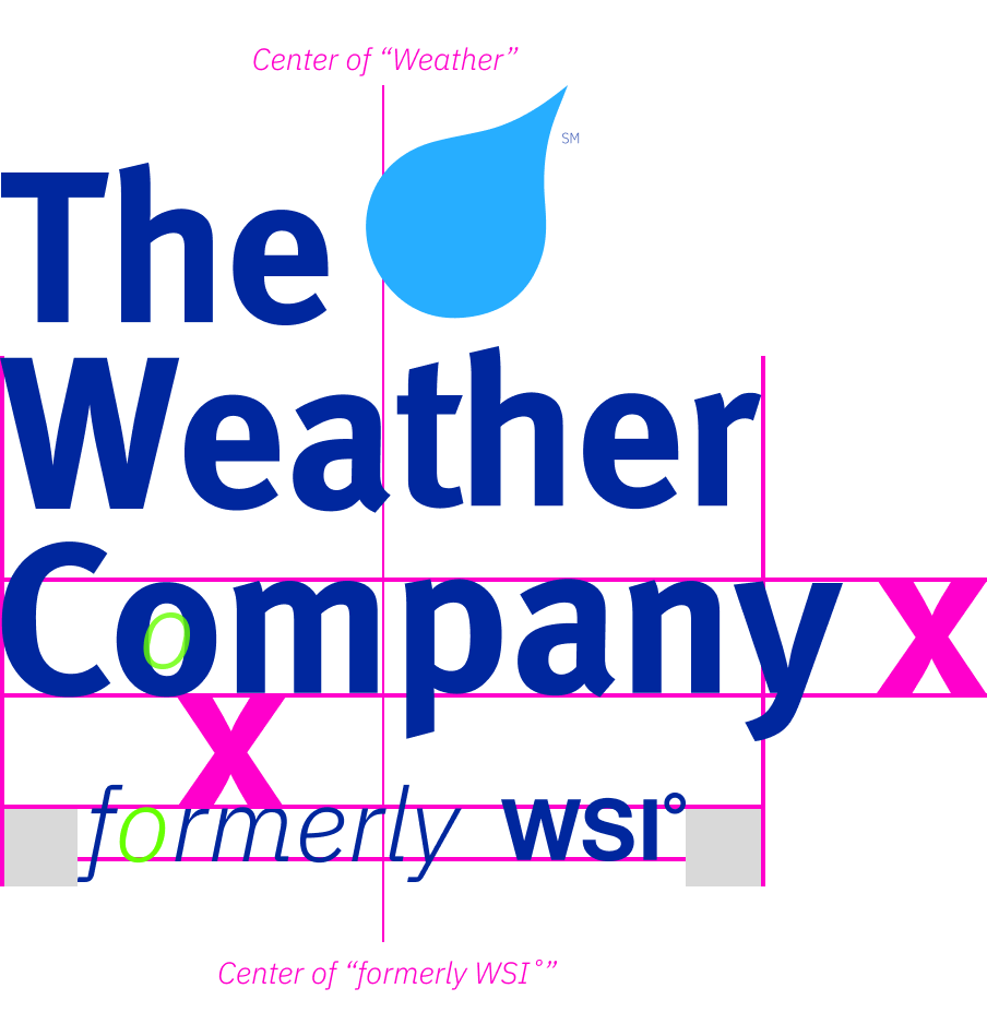
WSI Version
Spacing:
The Weather Company WSI wordmark follows the same design standards as the regular wordmark but with a “formerly WSI˚” the distance of the x-height of the lower case letters in the primary wordmark. The size relationship is based on the negative space of the “o” in both “Company and “formerly” and it is to be centered between “Weather” in the wordmark.
Usage:
The WSI version of the wordmark is to be used in all things associate with our Aviation line of business, with special priority at events where brand equity of the WSI˚ brand exists with the audience attending.
Versions of this wordmark can be found here.
Things to avoid
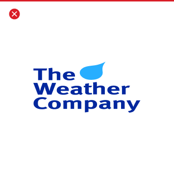
The Weather Company wordmark shouldn’t be placed into container shapes, altered or embellished in any way. It should only be used in the appropriate colors from The Weather Company brand color palette. The following examples reflect only a handful of samples of what NOT to do.

Don’t stretch or compress the logo.
Avoid containing the logo in a shape.
Don’t use drop shadows.


Don’t add your own taglines or mottos.
Don’t outline the wordmark
Don’t use an alternate typeface for the wordmark
Don’t use non brand colors
Don’t alter letter spacing of the wordmark
Don’t replace yhe “Drop” or add any other shape to the wordmark
Co-branding
Co-branding, also called “joint branding,” is when two companies form an alliance to work together to market a related set of products or partnership that neither company choose to jointly promote. The Weather Company doesn’t often co-brand, but when there is a need to please seek approval and sign off through our Creative Marketing Team. For more information about the co-branding approach see the below guidance and please contact the Creative Marketing Team.
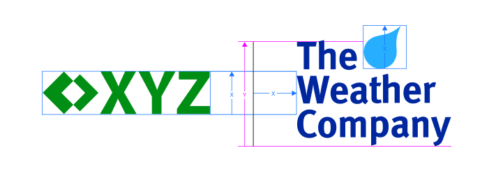
As recommended above, always default to our stacked version of our wordmark. The distance of both our wordmark and a partner logo should equal to the square distance of the height of the “Drop”. The partner logo height should equal the same “X” distance.
Both branded emblems should be separated at the center of the distance of two times “X” distance with a rule that equals the overall “The Weather Company” text height of “Y” (see above).
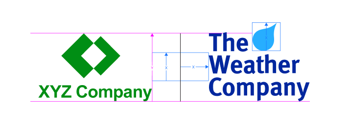
In situations where a partner logo is stacked, the distance between both our wordmark and a partner logo should equal to twice the distance of the height of the “Drop” (see above). The height of the partner logo should equal “Y” which is set by the height of “The Weather Company” text.
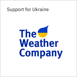
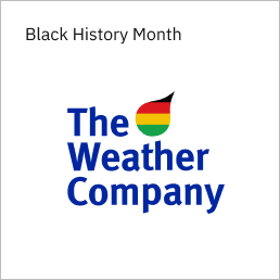
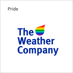
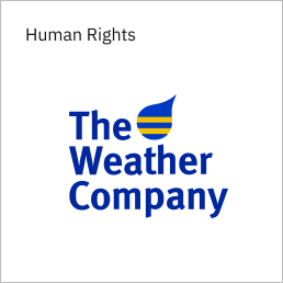
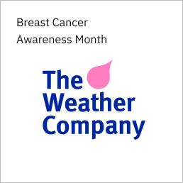
Cultural Moments
As a company, we have a core set of standards and when we choose to culturally demonstrate our support we can use our wordmark to express it. We would never employ this execution without context and a surrounding corporate narrative. Keep in mind that alteration of our wordmark must go through an approval process that starts with our Marketing Creative Department. Please don’t distribute any created iterations without expressed approval.
Here are some examples of Cultural Moments expressed through the wordmark:
Consumer Product Brands
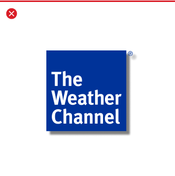
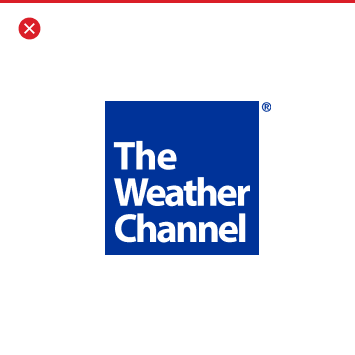
The Weather Channel logo
We are The Weather Company, but our flagship consumer facing products are The Weather Channel app and weather.com. Refer to the below guidance when using The Weather Channel brand for any marketing communication.
Primary
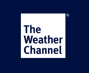
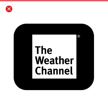
- Primary: For use over images or colored background
- White Square The Weather Channel Logo with knocked out text
- Preference is solid white logo, but can be used with transparency (80% opacity)
- Always use logo with registration (®) mark.
Secondary
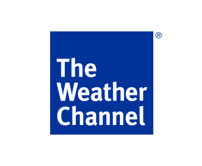
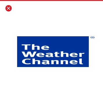
- Secondary: For use over a light background or as an app icon
- The Weather Channel Blue Logo
- No transparency. Opaque white text over Opaque blue square.
- Use the below “The Weather Channel Blue” swatch reference for color.
The Weather Channel Blue
003399
Severe
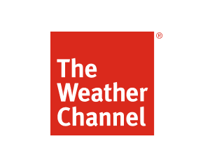
- Severe: For use during severe weather
- The Weather Channel Red Logo
- No transparency. Opaque white text over Opaque blue square.
- Use the below “The Weather Channel Red” swatch reference for color.
- – Red: Hex #DA291C
The Weather Channel Red
DA291C
Circle
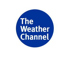
With Marketing Approval: For limited use – needs approval
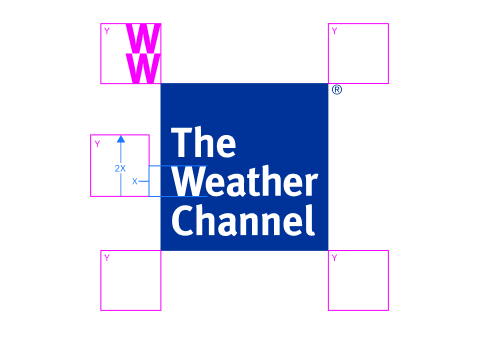
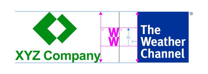
The Weather Channel – Clear Space
To not feel crowded and to stay readable The Weather Channel logo needs appropriate spacing surrounding it. The proper clear space around The Weather Channel logo is defined by (Y), which is equivalent to twice the height of the logo’s capital “W.” (represented by (X) value in the diagram below). This is the minimum area around the logo that must be entirely free of any other typography or graphics. Apply this formula universally, regardless of the size of the logo.
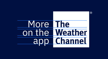
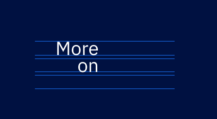
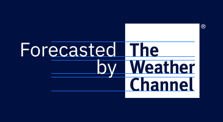
The Weather Channel – Attribution
In non-clickable and clickable representations of the logotype it is recommended to attribute that The Weather Channel is supplying our weather data with the noted attribution text “More on the app”. If the attribution is clickable and cannot drive to the app – secondary option is ‘More on’. The limited use option is for partners who do not allow clicks to drive to The Weather Channel properties and is supported with ‘Forecasted by’.
All options include use of the White Square logo – any variations need marketing approval.
When adding the attribution text it is best to represent it with the corresponding height of the text within the logotype for consistency. If the logotype is represented at an extremely small size, this allows a readability consistency and balance to assure all text can be read.
Clickable to the app attribution
Non-clickable to the app attribution
Partner limited
The Weather Channel – Things to avoid
The Weather Channel logo shouldn’t be placed into container shapes, altered or embellished in any way. It should only be used in the appropriate colors from the brand palette. The following examples reflect only a handful of samples of what not to do.
Don’t stretch or compress the logo.
Avoid containing the logo in a shape.
Don’t use drop shadows.
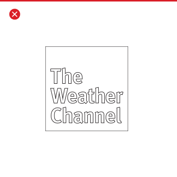

Don’t outline the logo
Don’t change the color of the logo without consent from the Brand Team
Never substitute the typeface of Meta Sans Bold with another typeface
The Weather Channel – Co-branding
Co-branding, also called “joint branding,” is when two companies form an alliance to work together to market a related set of products or partnership that neither company choose to jointly promote. The Weather Company doesn’t often co-brand, but when there is a need to please seek approval and sign off through our Creative Marketing Team. For more information about the co-branding approach see the below guidance and please contact the Creative Marketing Team.
Logo Lockup
Our logo The Weather Channel and The Weather Company lockup is to be used for only parts of our business when the brand equity of both our consumer brand and our business brand can elevate the prospective partnerships for the overall business. The lines of business using the lockup are:
• Advertising
• Government/ Defense
• Business Development
For any additional guidance regarding our logos in regards to best practices, spacing, colration, etc. see our Wordmark section of this Expression Guide.
Spacing between the logos are based on “X” the square height of the “Drop” distance, and should be the measured distance between the “r” in The Weather Company logo; the separating rule; and the edge of The Weather Company logo edge. The size of The Weather Channel is based on the baseline of the word “Company” and the X height of “The” in the Wordmark.
Example without guides
Lockup with Weather Means Business
For use only with our Advertising line of business:
Weather Means Business beneath the the lockup is the preferable treatment in marketing material. The only time it is not to be used is when it becomes repetitious or a design constraint would impede sizing and optimal brand recognition of out logos.
Spacing between the logos are based on “X” the square height of the “Drop” distance, and should be the measured distance between the “r” in The Weather Company logo; the separating rule; and the edge of The Weather Company logo edge. The size of The Weather Channel is based on the baseline of the word “Company” and the X height of “The” in the Wordmark. The “Weather Means Business” should be spaced below by a distance of “X” (the Drop height) to the baseline of the “Weather Means Business.” The size of “Weather Means Business” is determined by the width of the entire lockup.
Example without guides
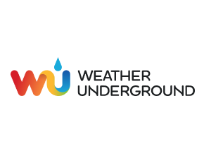
Weather Underground logo
Weather Underground, often referred to as WU (pronounced /wo͞o/) is also a weather service brand acquired by The Weather Company. When using the Weather Underground logo, use the reference below as guidance.
Primary – Stacked
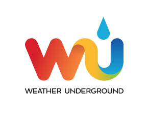
- Primary: For use over images, colored, or white background
- Full stacked version
- CMYK or RGB use cases
- Be sure to have the original art file being color gradients are dependent on the original art.
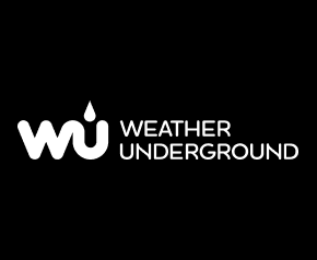
Reversed out – Stacked
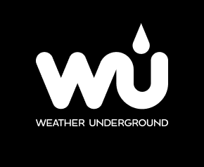
- Reversed out – Stacked: For use over images, or colored background
- Full stacked version
- Single color use cases
Inline
- Inline: For use over images, colored, or white background in narrow placements
- Inline version
- CMYK or RGB use cases
- Be sure to have the original art file being color gradients are dependent on the original art.
Reversed out – Inline
- Inline: For use over images, colored, or white background in narrow placements
- Inline version
- Single color use cases
Weather Underground – Clear space
In order for the wordmark to not feel crowded and to stay readable it needs appropriate spacing surrounding it. Use the following guidance.
Stacked Distance:
The “X” variable is based on the distance that is the height of the drop. When establishing this distance, the clear space surrounding the wordmark needs to be the height and width of “X” distance at a minimum.
Inline Distance:
The “X” variable for distance is based on the distance that is the height of the “WU” and stacked “Weather Underground” (X). When establishing this distance, the clear space surrounding the wordmark needs to be the height and width of (X) distance at a minimum.
Storm logo
Storm app is also a weather service brand acquired by The Weather Company. When using the Storm logo, use the reference below as guidance.
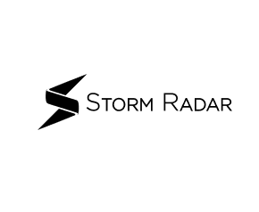
Primary – Stacked
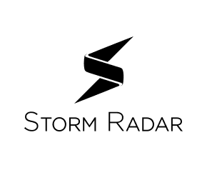
- Primary: For use over images, colored, or white background
- Full stacked version
- CMYK or RGB use cases
- Be sure to have the original art file being color gradients are dependent on the original art.
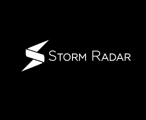
Reversed out – Stacked
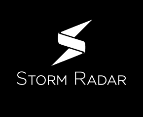
- Reversed out – Stacked: For use over images, or colored background
- Full stacked version
- Single color use cases
Inline
- Inline: For use over images, colored, or white background in narrow placements
- Inline version
- Single color use cases
Reversed out – Inline
- Reversed out – Inline: For use over images, colored, or white background in narrow placements
- Inline version
- Single color use cases
Storm – Clear Space
In order for the wordmark to not feel crowded and to stay readable it needs appropriate spacing surrounding it. Use the following guidance.
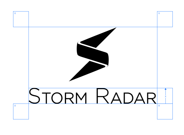
Stacked Distance:
The “X” variable is based on the distance that is the height of the drop. When establishing this distance, the clear space surrounding the wordmark needs to be the height and width of “X” distance at a minimum.
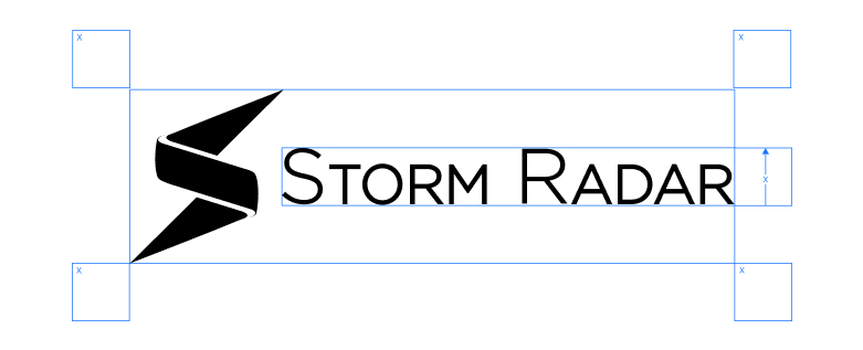
Inline Distance:
The “X” variable for distance is based on the distance that is the height of the “WU” and stacked “Weather Underground” (X). When establishing this distance, the clear space surrounding the wordmark needs to be the height and width of (X) distance at a minimum.